

Tag Archives: logo design
New Hope Identity

 Completed a logo and brand for new cupcake business ‘Meggie’s Cupcakes’ this week to run across their new website, stationery, packaging and banners.
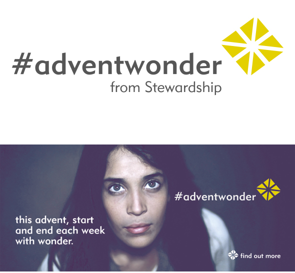 I’ve just completed a logo and blog, website and carousel banner designs for Stewardship‘s Christmas 2013 campaign ‘Advent Wonder’. The logo icon was created to look like both a wrapped gift as well as resemble the star over Bethlehem.
 Have just completed a new logo and brand image for Covered Collection which offers a fresh take on decoupage through recycling and transforming the previously plain appearance of functional glassware and ceramics. Every item is hand decorated and finished by Catherine Bradley. Catherine wanted a simple and elegant logo design to use on printed materials and for stickers for products. Find Covered Collection on Facebook and online.
 I’ve just completed a logo design for a new baking and catering business, Bodin’s. The simple bowl design reflects the hand-baked preparation of the food, and the logo will be used on printed materials, labels, packaging and potentially on napkins and plates. Will add more photos of the logo in use soon.
 An organisation ‘committed to offering practical, tailored support to help transform the world’, Stewardship contacted me recently asking for a logo and email banner design for their new email campaign ‘The Art of Giving’. This ten part series looks deeper at generosity and follows current campaign ’40acts’ which has been happening over the past few weeks running up to Easter. Find out more about what they do here.
 Recently I re-branded and created a new logo for a worship event at Aldridge Parish Church to be used across all printed publicity materials and for web and screen.
 I’ve recently designed a logo for a new initiative by a local youth group, to give up their time once month to help their community in whatever way they can. The iconic four triangles/arrows design represents going outwards in all directions from a central point, and the colours needed to be eye catching and bright for wearing on hoodies and tshirts.